Aug. 21, 2018
Hot Ones: Data Visualizations
IntroductionHot Ones is an interview show that presents a twist on the standard talk show format. Guests consume ten wings that become progressively hotter while being asked questions by interviewer Sean Evans.
As a fan, and in the spirit of the Hot Ones' tagline, "The show with hot questions, and even hotter wings," I've created some spicy data visualizations.
A Scoville Adventure into Hot Ones
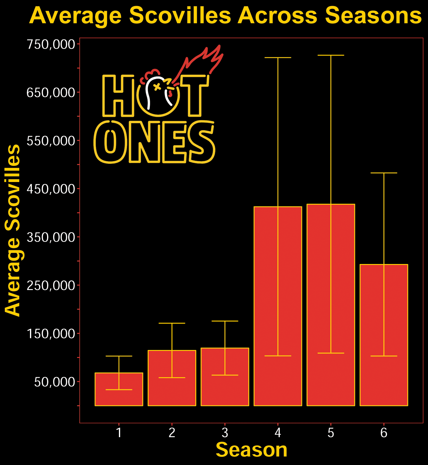
Hot Ones changes their hot sauce lineup every season.1 One of the initial questions I had was does the spice level change from season to season? I found a couple resources that provided information about the hot sauces and corresponding Scovilles.2 3 The dataset I created is available for download in the footnotes.4

Average Scovilles of wings grouped by season number. Error bars represent standard error.
Looking at the figure above, you can see that seasons 4 and 5 were the spiciest, on average. You can also see that the variance increased dramatically along with the large mean change. This means the jumps in Scoville from wing to wing was larger, on average, in these seasons.
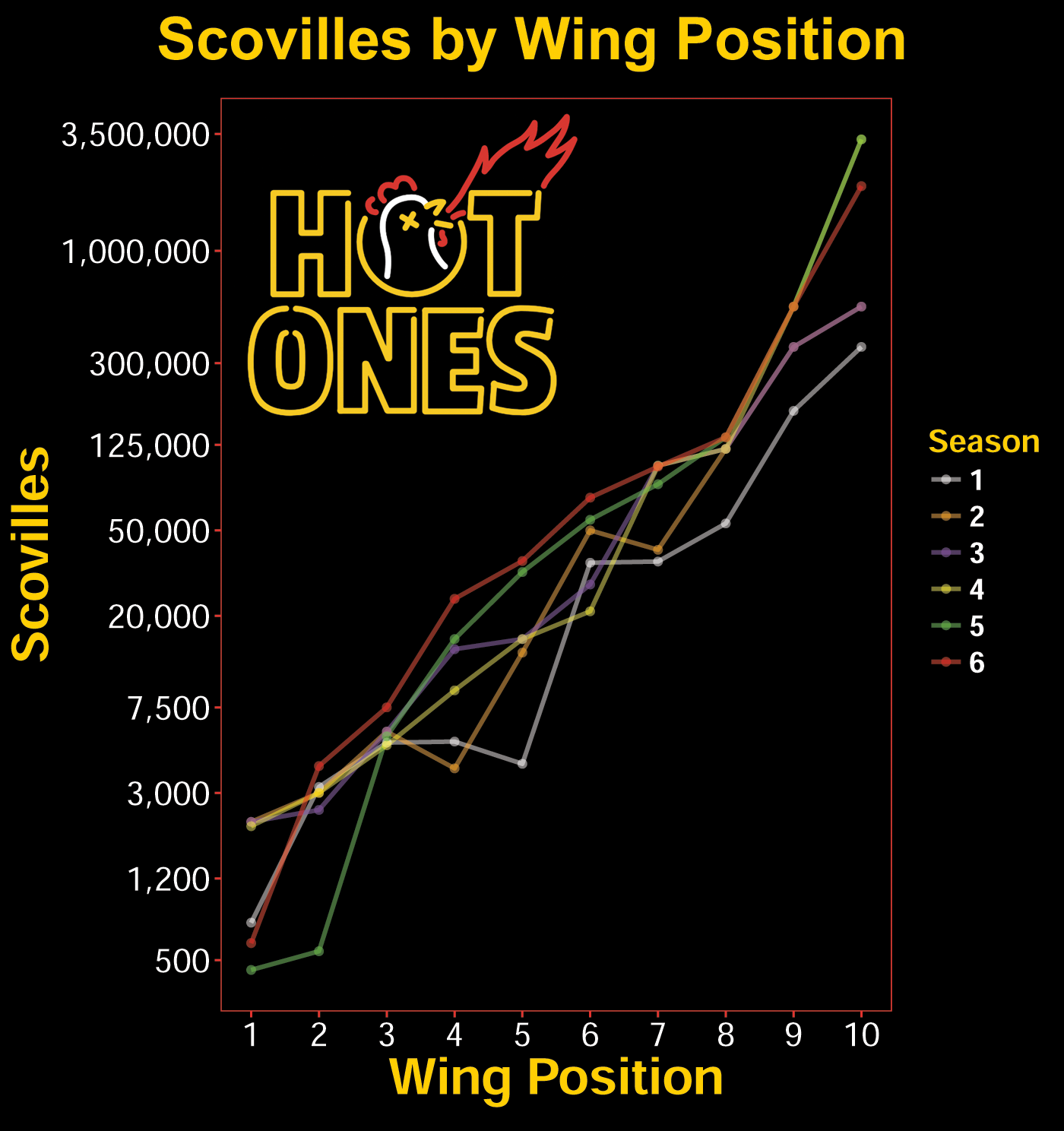
To get a more detailed view of the wing challenge the guests are participating in, I examined the hot sauces by wing position (i.e., the wing sequence from 1 to 10).

Scovilles of Hot Ones' wing lineups across all six seasons.
A log10 transformation was used for the above figure. This was done in response to the skewed and wide ranging nature of the data. When intrepreting the figure, keep in mind that because of the scaling the same vertical distance, spatially, at the lower y-levels includes less numbers than at the upper regions.
You can see from the figure that season 6 has higher Scovilles in the middle of the wing array than any previous season. Season 6 presents the hottest wings from 2-6 span of wings.
Season 5 is interesting. It had the slowest uptake in Scovilles, but rose quickly thereafter. It also had the widest range in Scovilles in all the seasons.
Although this figure allows us to see the general pattern, the overlapping nature of the data makes it difficult to readily understand how the Scovilles have changed over the seasons.
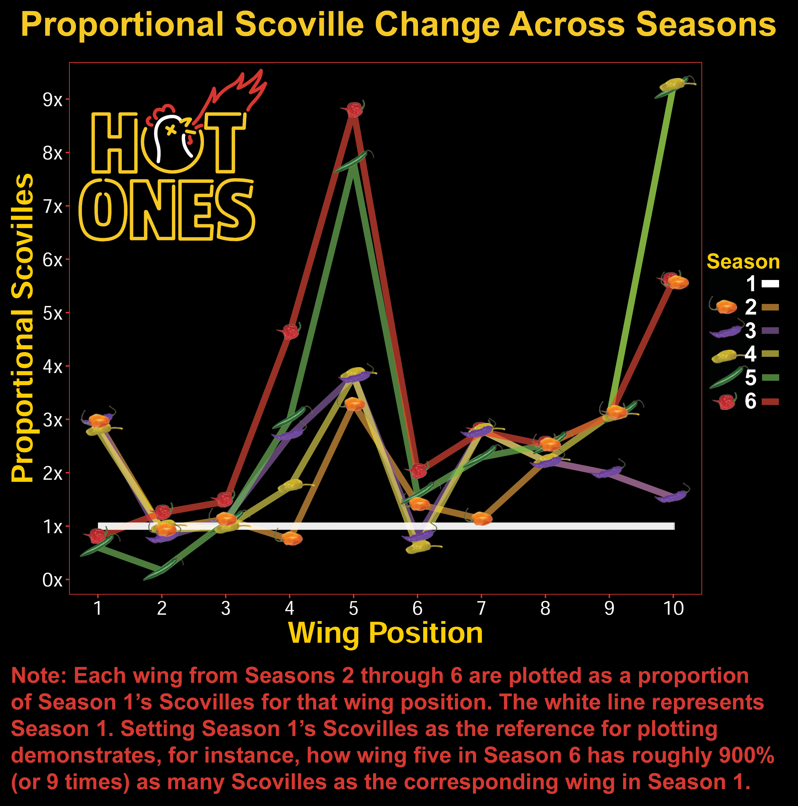
By plotting the data points by their relation to season 1, we can more clearly see how the hot sauces evolved in their Scovilles across the seasons.

The spike we see at position five is, in part, pronounced because season 1's hot sauce had fewer Scovilles than the fourth wing of that lineup. You can see this in the log transformed figure. Seasons 5 and 6 really cranked up the heat here too though.
The introduction of the Hot Ones' original hot sauce, The Last Dab, in season 4 was a game changer in terms of Scovilles on the Show. This 3.3 million Scoville sauce is far and above the hottest sauce they've featured on the show. Interestingly, the jump in hot sauce on the tenth wing in season 1 (Mad Dog 357) to The Last Dab on season 4-6, is roughly the same as the jump for wing five in season 1 and season 6.
The Last Dab Reduxx was introduced in season 6, which dropped the Scovilles in the last wing to 'only' 2 million. Despite this fact, I think season 6 offers the toughest lineup in the series' history (in term of Scovilles). Although the first wing in season 6 is weak, it can lull you into a false sense of security, as a rocket is about to take-off. Wings two through nine are basically at the hottest levels of Scovilles for each position in the history of the show. I'm not sure how much a 1.2 million Scoville difference really matters at the point the tenth wing is reached.
Fivethirtyeight wrote an interesting piece on the topic of spice perception, that I'll mention here.5
The figures were made mostly in R with aesthetic additions in Photoshop (Hot Ones Logo, pepper plot points).
If you would like to create your own Hot Ones themed ggplot figures, I've included my R theme code below.
| R Code: 'Hot Ones' ggplot Theme |
|
# Assigning Hot Ones Color Theme yellow <- "#FFCE00" red <- "#E4332F" white <- "#FFFFFF" # Attach the code below to your ggplot theme(axis.title.x = element_text(face="bold", size = 24, color=yellow),
axis.title.y = element_text(face="bold", size = 24, color=yellow),
axis.text.x = element_text(size=16, color=white), axis.text.y = element_text(size=16, color=white), axis.title = element_text(size = 22, color=yellow), panel.border = element_rect(color=red), panel.grid.major = element_blank(), panel.grid.minor = element_blank(), legend.key = element_rect(fill='black'), legend.background = element_rect(fill="black", color='black'), legend.text = element_text(color = 'white', face='bold', size=14), legend.title = element_text(color=yellow, face='bold', size=15), plot.background = element_rect(fill="black", color='black'), panel.background = element_rect(fill="black", color='black'), axis.ticks= element_line(color=red)) |
Footnotes:
1 Hot Ones has changed hot sauces mid season on a few occasions. When plotting an individual data point on the figures presented here, I averaged the wing position for a given season into a single value. The average Scoville value was also weighted by number of appearances in episodes throughout the season.
2 Datasource 1 (Reddit)
3 Datasource 2 (Reddit)
4 Download Hot Ones dataset (.csv) The dataset is organized at the level of an individual wing (in long-format). It contains information on the Scovilles, hot sauces, and guests for every episode of Hot Ones through season 6.
5 FiveThirtyEight Article on the measurement of heat/spice.